
 A new year has begun, and with it, a new Color of the Year from Pantone: 18-3838 Ultra Violet. The 2018 hue is a bold and provocative color that conveys creativity, community, and discovery (both inward and outward). For lovers of color (like brand geeks and designer types), the Color of the Year has become a much-anticipated trendsetter as well as a representation of our collective “cultural vibe.”
Throughout the year, many businesses use the Color of the Year in small doses (branded images for social media, for example) to keep their brand current and fresh. This is especially fitting for creative-minded businesses such as interior designers and print shops, but can also work well used in engaging content for larger community-focused businesses, not-for-profits, and businesses in the health and tech sectors. If your audience/clients/customers would appreciate your recognition of the Color of the Year, why not figure out a way to work with it? (Hello, we’re sorta doing that right now!)
Here are some ideas and tips for you to get those creative, Ultra Violet juices flowing (Ew. Sorry about that…):
Gram It.
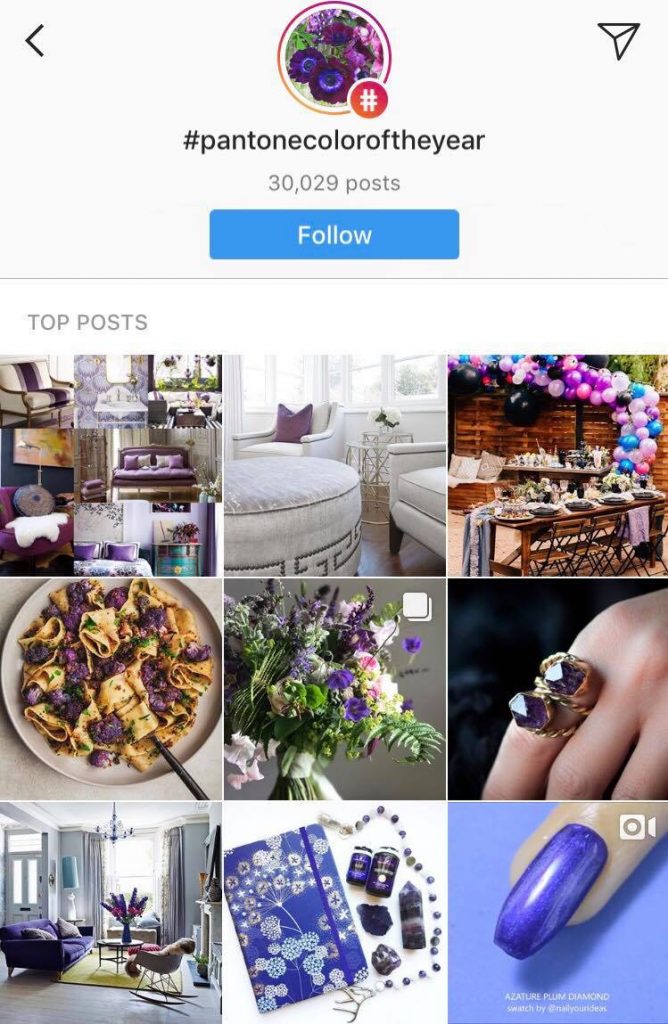
Instagram has become a necessity for creative businesses. The ability to regularly and easily reach out to folks with gorgeous pictures of your style or products (most of whom would’ve never heard of you otherwise) makes it a priceless tool. You can use #PantoneColorOfTheYear and post pics of your work incorporating Ultra Violet (or similar shades of purple … we can all appreciate a good vibrant purple, right?) and in doing so, you can reach people who follow that hashtag (a new-ish feature of Instagram which this designer LOVES.)
Look In Nature.
Everyone knows this is an Earth-friendly, back-to-nature era. If either of those descriptors speaks to your brand, seek out some lovely shades of purple found in nature that may apply to your brand. Verbena blossoms, lavender, and violets in your landscaping, violet-tinged sunrises on a job site, purple shadows cast in the snow, distant purple mountains to explore … think about how you can incorporate photos of the shades of Ultra Violet found in nature and then (for goodness sake) take some hi-resolution photos (or pay a professional to take them) to use on your website, in social media posts, in ads, in print materials, etc.
Get Psychological.
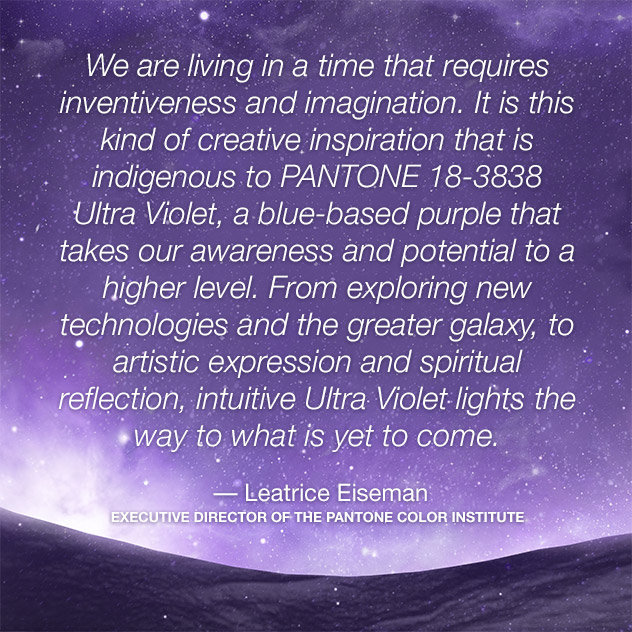
We’ve all heard at least the basics of the psychology of color. The psychology of the Color of the Year is a huge part of why it was chosen in the first place. From Pantone:
“Nuanced and full of emotion, the depth of PANTONE 18-3838 Ultra Violet symbolizes experimentation and non-conformity, spurring individuals to imagine their unique mark on the world, and push boundaries through creative outlets.”
(There’s a lot more on that HERE.)
Is your business concerned with health, science, or neuroscience/medicine? The HOWs and WHYs of color psychology can be discussed in blogs and social media posts, and the Color of the Year can be used as a jumping off point for discussions that are relevant to your brand.
Regardless of how you use PANTONE 18-3838 Ultra Violet, one thing is for sure: No one will accuse you of “playing it safe” with your color palette … unlike the 2006 Color of the Year Sand Dollar (seriously? It’s beige!) or the “meh” Cerulean (grey blue) of 2000. Take the big step – color your world!